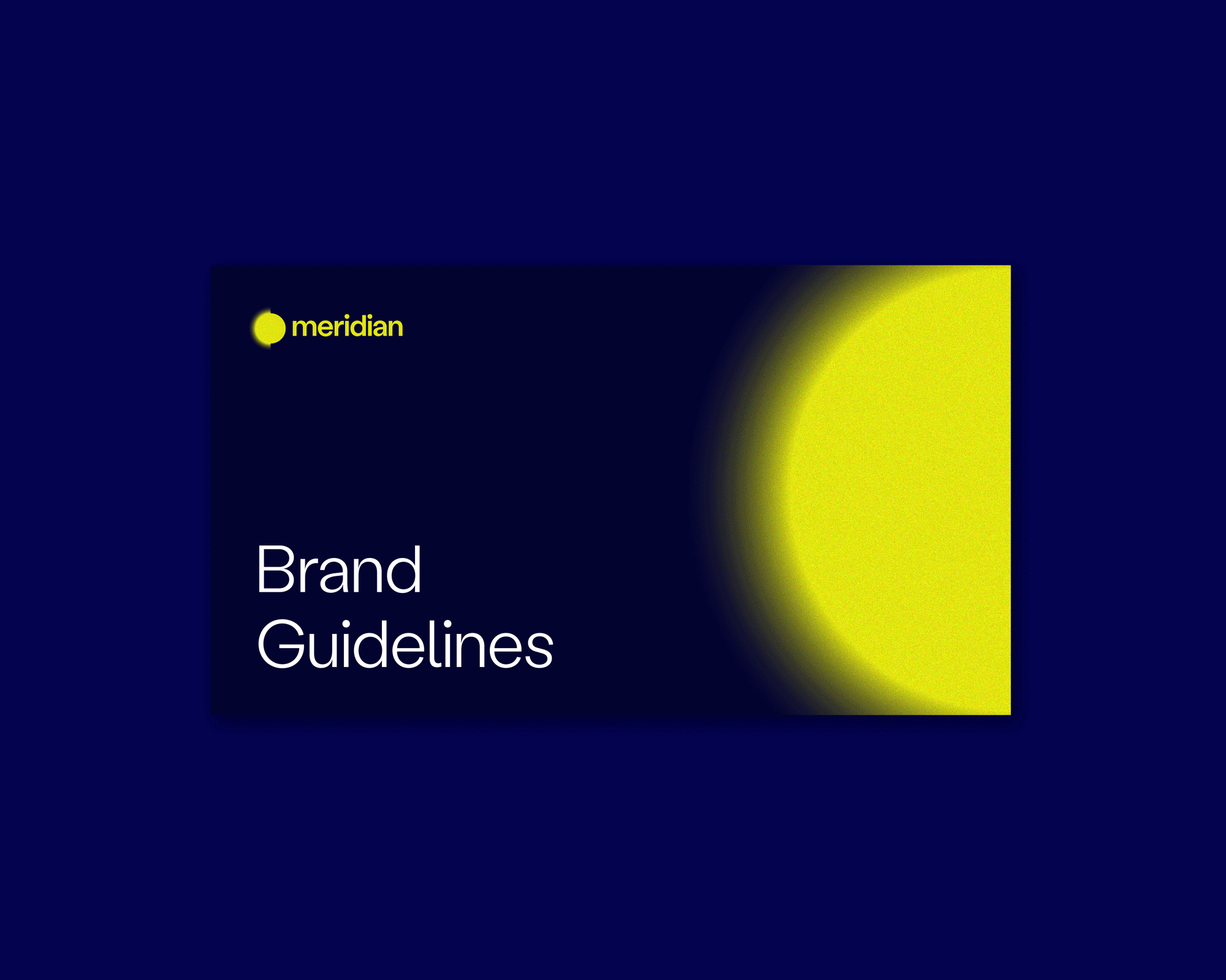
Meridian
Meridian
Meridian
Meridian
Meridian
BRANDING / VISUAL IDENTITY / SOCIAL MEDIA
BRANDING / VISUAL IDENTITY / SOCIAL MEDIA
BRANDING / VISUAL IDENTITY / SOCIAL MEDIA
BRANDING / VISUAL IDENTITY / SOCIAL MEDIA
BRANDING / VISUAL IDENTITY / SOCIAL MEDIA
From ONA to Meridian — a bold new identity for an agency on a mission: crafting powerful stories that champion ocean conservation.
From ONA to Meridian — a bold new identity for an agency on a mission: crafting powerful stories that champion ocean conservation.
From ONA to Meridian — a bold new identity for an agency on a mission: crafting powerful stories that champion ocean conservation.
From ONA to Meridian — a bold new identity for an agency on a mission: crafting powerful stories that champion ocean conservation.
From ONA to Meridian — a bold new identity for an agency on a mission: crafting powerful stories that champion ocean conservation.
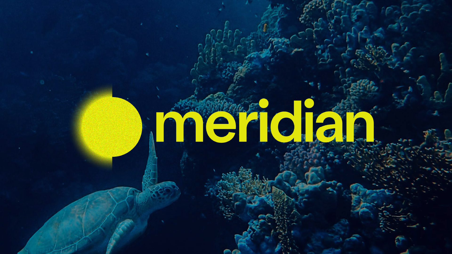
The idea began with the globe — not as a geographic meaning, but as an abstract, fluid form. Inspired by the ocean’s vastness and motion, it became a symbol of global connection and environmental urgency.
Meridian’s logotype traces a single line — a meridian — sweeping across this imagined sphere. It begins as a blur, then sharpens into focus, echoing a horizon coming into view through shifting tides.

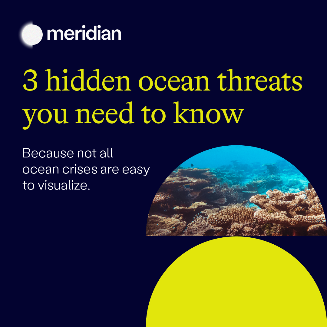
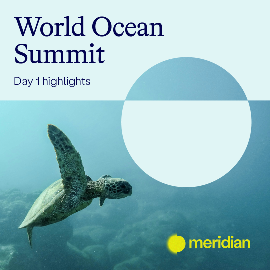
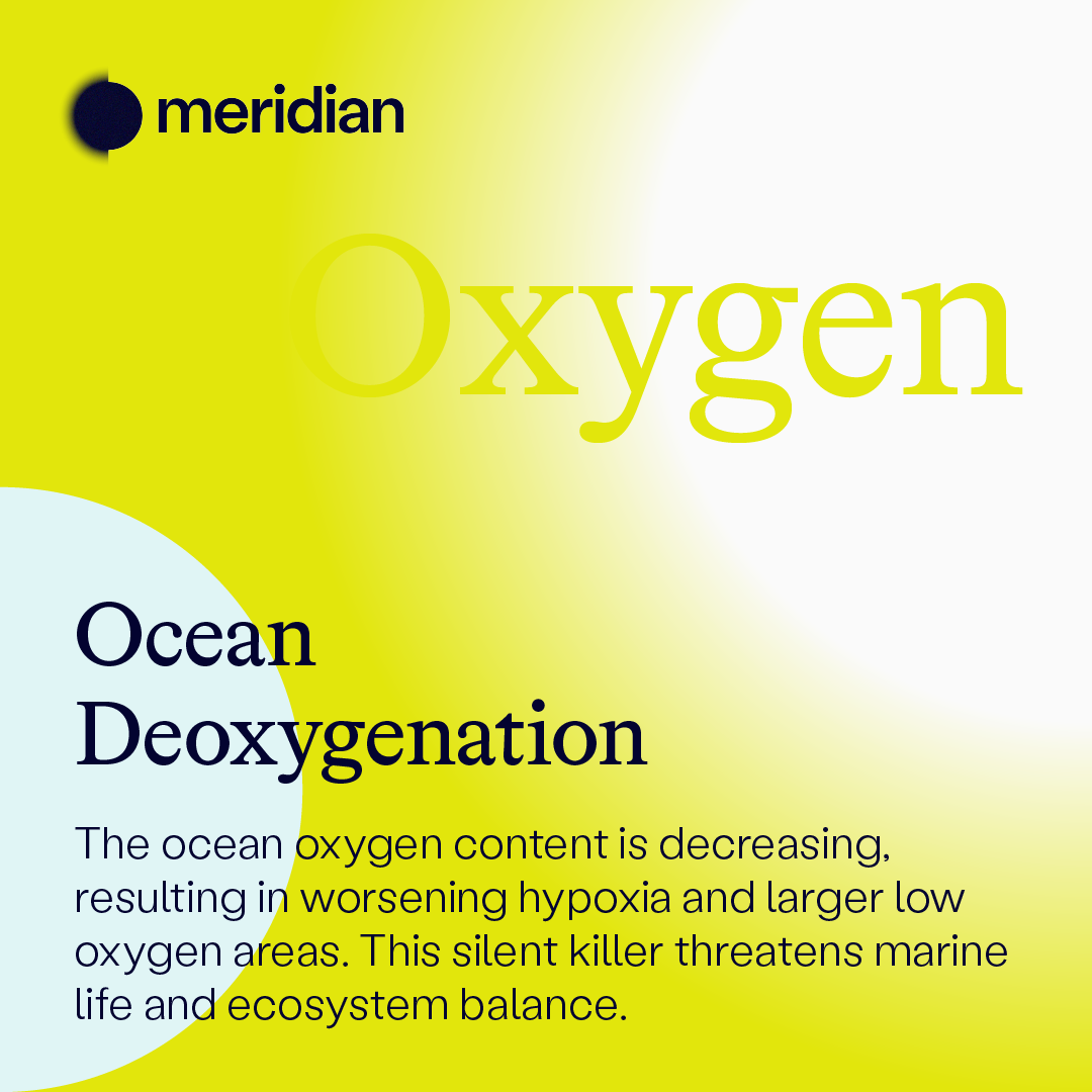
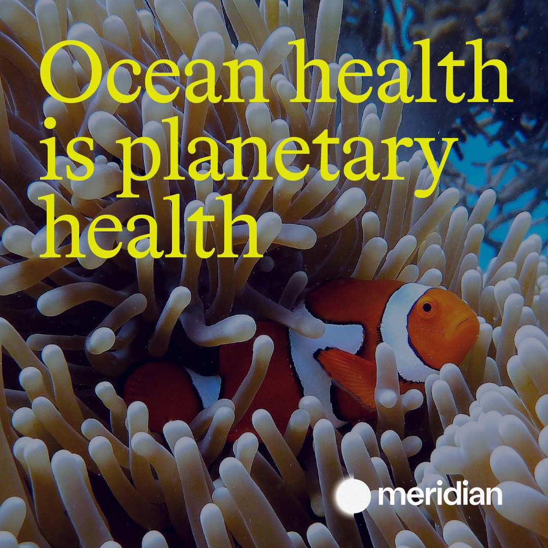
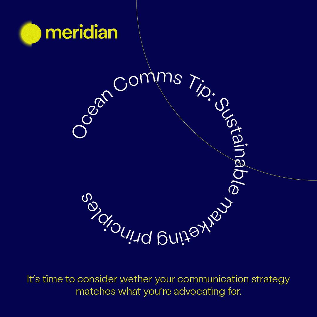
This visual journey reflects the agency’s mission: to bring clarity to ocean conservation storytelling. To transform fragmented, overlooked messages into powerful narratives that cut through the noise and drive change.
This visual journey reflects the agency’s mission: to bring clarity to ocean conservation storytelling. To transform fragmented, overlooked messages into powerful narratives that cut through the noise and drive change.
This visual journey reflects the agency’s mission: to bring clarity to ocean conservation storytelling. To transform fragmented, overlooked messages into powerful narratives that cut through the noise and drive change.
This visual journey reflects the agency’s mission: to bring clarity to ocean conservation storytelling. To transform fragmented, overlooked messages into powerful narratives that cut through the noise and drive change.